Use people and sporting imagery to humanise the organisation.
UI/UX · RESPONSIVE WEB DESIGN · VISUAL DIRECTION
Singapore National Paralympics Council.
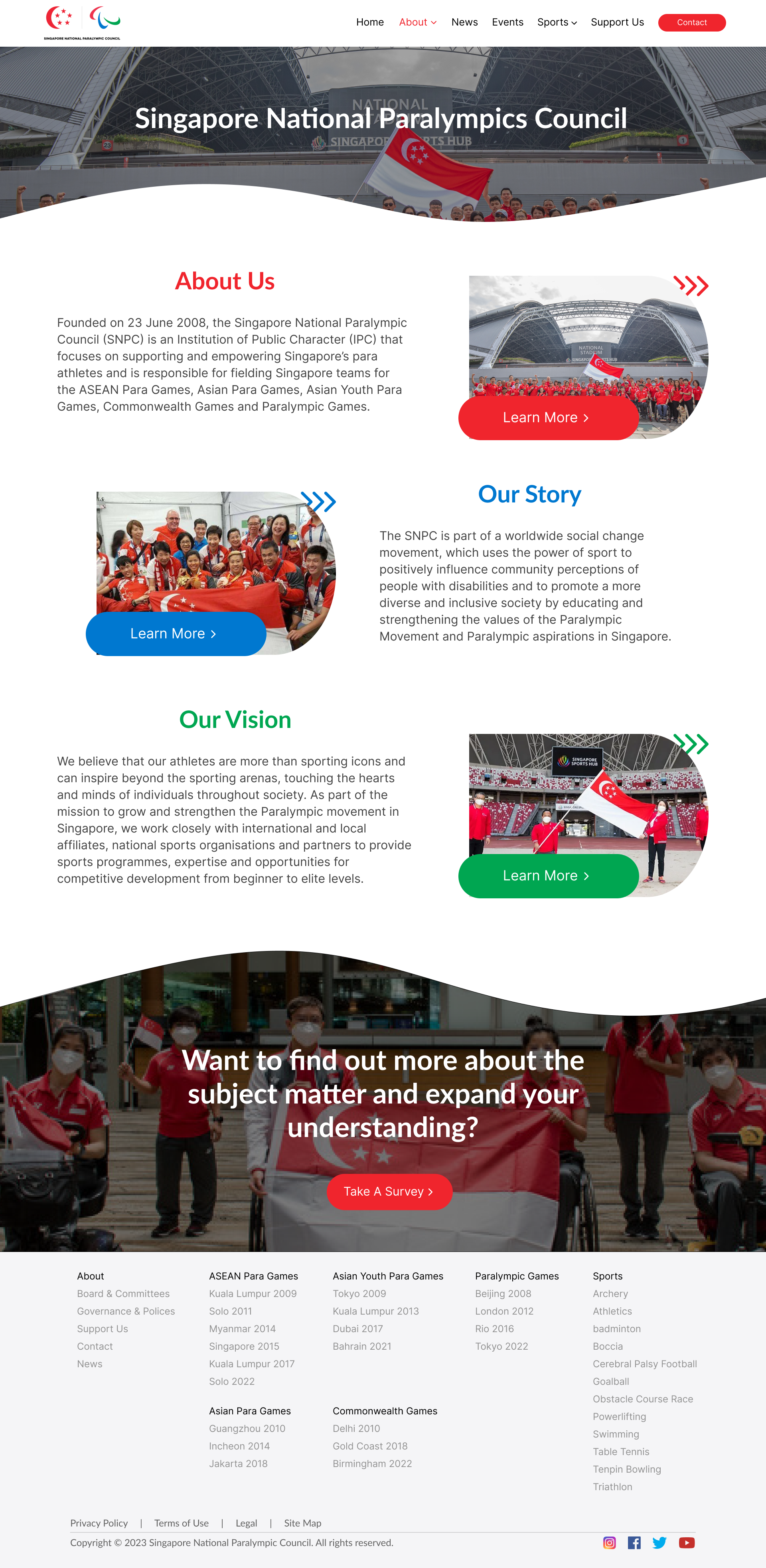
A responsive website redesign exploring how Singapore para sport, athletes, events and organisational information can be presented through a stronger and more engaging digital experience.
01 / CHALLENGE
Give para sport a digital presence with energy and clarity.
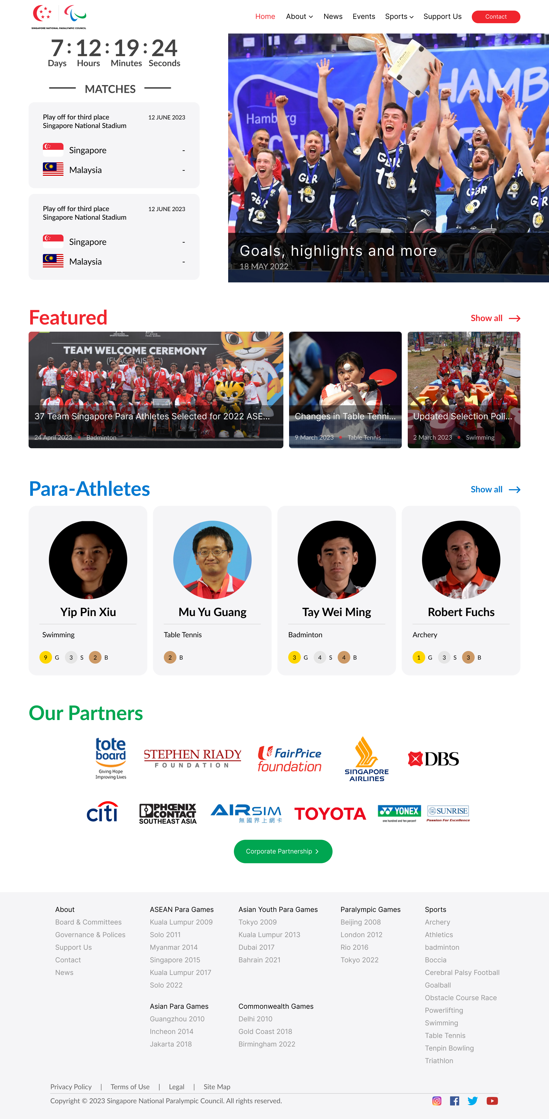
The redesign needed to bring athletes, sports, events and organisational information into one experience without making the website feel crowded.
Create clearer paths between sports, stories and organisational content.
Re-prioritise content for mobile instead of simply shrinking desktop layouts.
02 / DESIGN THINKING
Structure the information. Shape the experience.
MY ROLE
Information Architecture
UI/UX Design
Visual Direction
Responsive Design
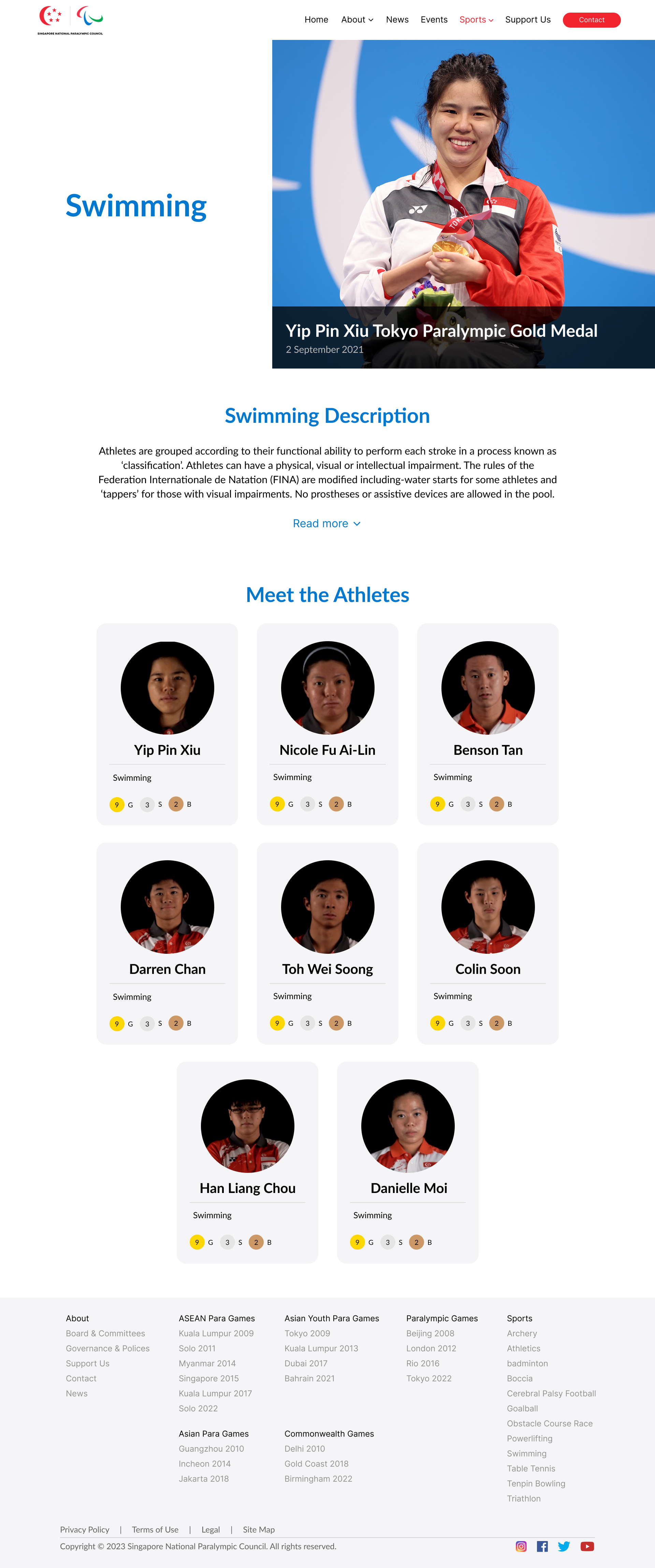
Athlete-led imagery
Large photography gives athletes visual importance and keeps the experience human.
Big messages first
Strong headings and clear content blocks help visitors scan before reading deeper.
Bold, not chaotic
Dark sections, strong colour and whitespace create energy without sacrificing clarity.
One visual language
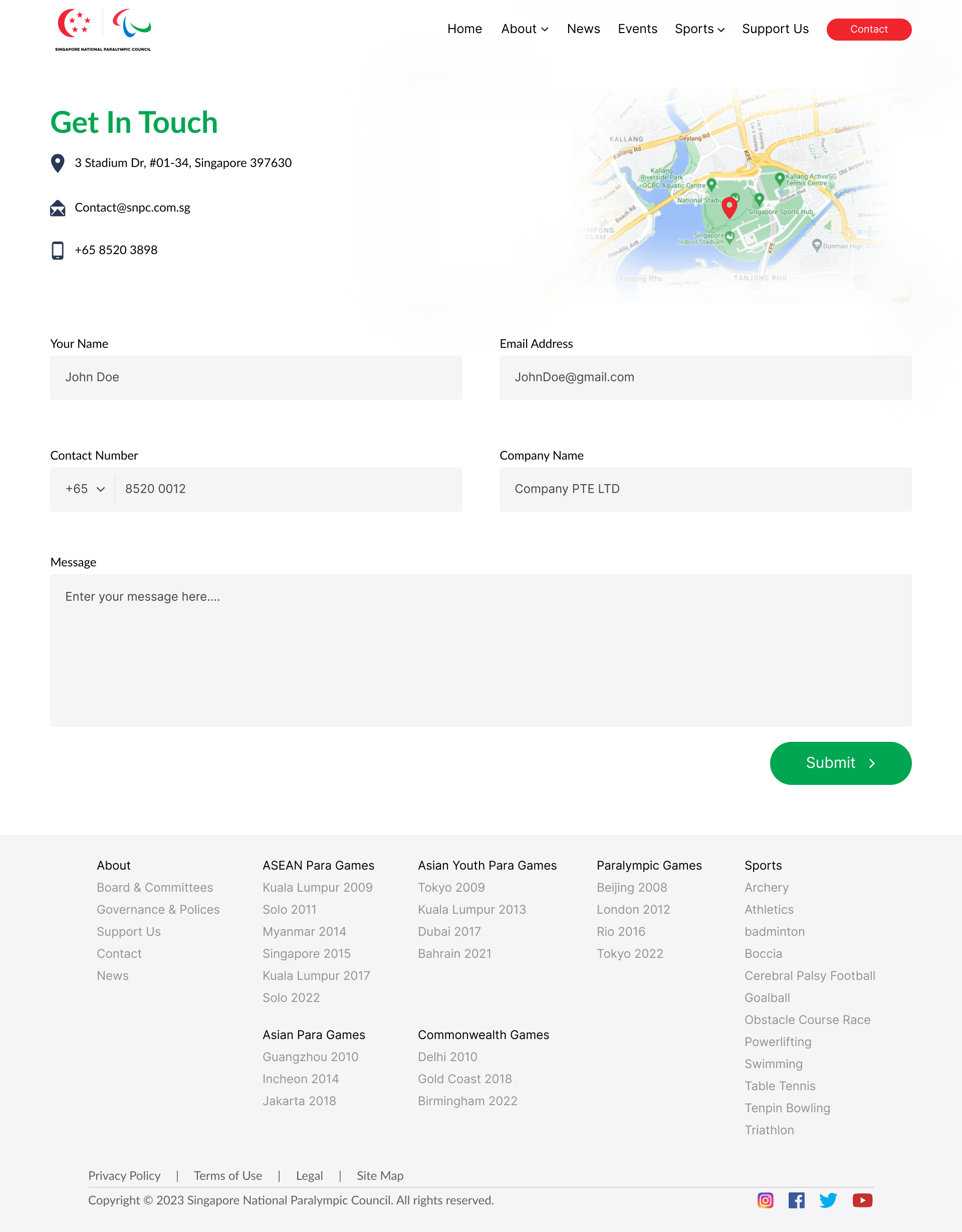
Repeated typography, spacing and page structures connect every area of the site.
03 / THE EXPERIENCE
Space for storytelling. Clearer sequencing on mobile.
RESPONSIVE APPROACH
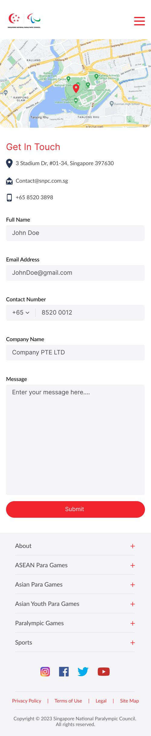
Desktop uses large imagery and generous content sections. Mobile reorganises those same ideas into a more focused vertical journey.



04 / KEY DECISIONS
Give every section a job to do.
Put people at the centre.
Athlete imagery keeps the experience connected to real sporting achievement.
Separate content types.
Events, athletes, sports and organisational information each receive clearer space.
Adapt instead of compress.
Mobile layouts reconsider order and hierarchy instead of scaling desktop down.
05 / VISUAL SYSTEM
Bold enough for sport. Structured enough for information.
Oversized headings identify the most important messages quickly.
Photography carries emotion while the interface supports it.
Blue, dark surfaces and bright accents create sporting energy.
Whitespace and section changes keep dense information readable.
06
OUTCOME & REFLECTION
A redesign is more than changing how it looks.
The project strengthened my understanding of how visual identity, information architecture and responsive layout need to work together.
I would continue refining navigation, interaction states, content accessibility and usability across more screen sizes.