Create one visual language across every touchpoint.
BRAND IDENTITY · WEB DESIGN · VISUAL DIRECTION
Eternal Shutterwave.
A photography brand created around emotion, memory and visual storytelling — extending from the digital experience into print and social media communication.
01 / CHALLENGE
Photography captures a moment. The brand should capture a feeling.
Eternal Shutterwave needed more than a gallery. The identity had to feel recognisable across the website, printed collateral and social communication.
Keep photography at the emotional centre of the brand.
Balance cinematic, premium and approachable visual direction.
02 / BRAND DIRECTION
One identity. Multiple expressions.
MY ROLE
Brand Identity
UI/UX & Web Design
Brand Collateral
Social Media Design
A dark foundation
Dark surfaces allow photography and the red graphic language to dominate.
The wave
The flowing red wave links digital, physical and promotional touchpoints.
Images do the talking
Large imagery keeps the work itself at the centre of the brand.
Emotion over noise
Restraint around the photography keeps the overall experience cinematic.
03 / THE EXPERIENCE
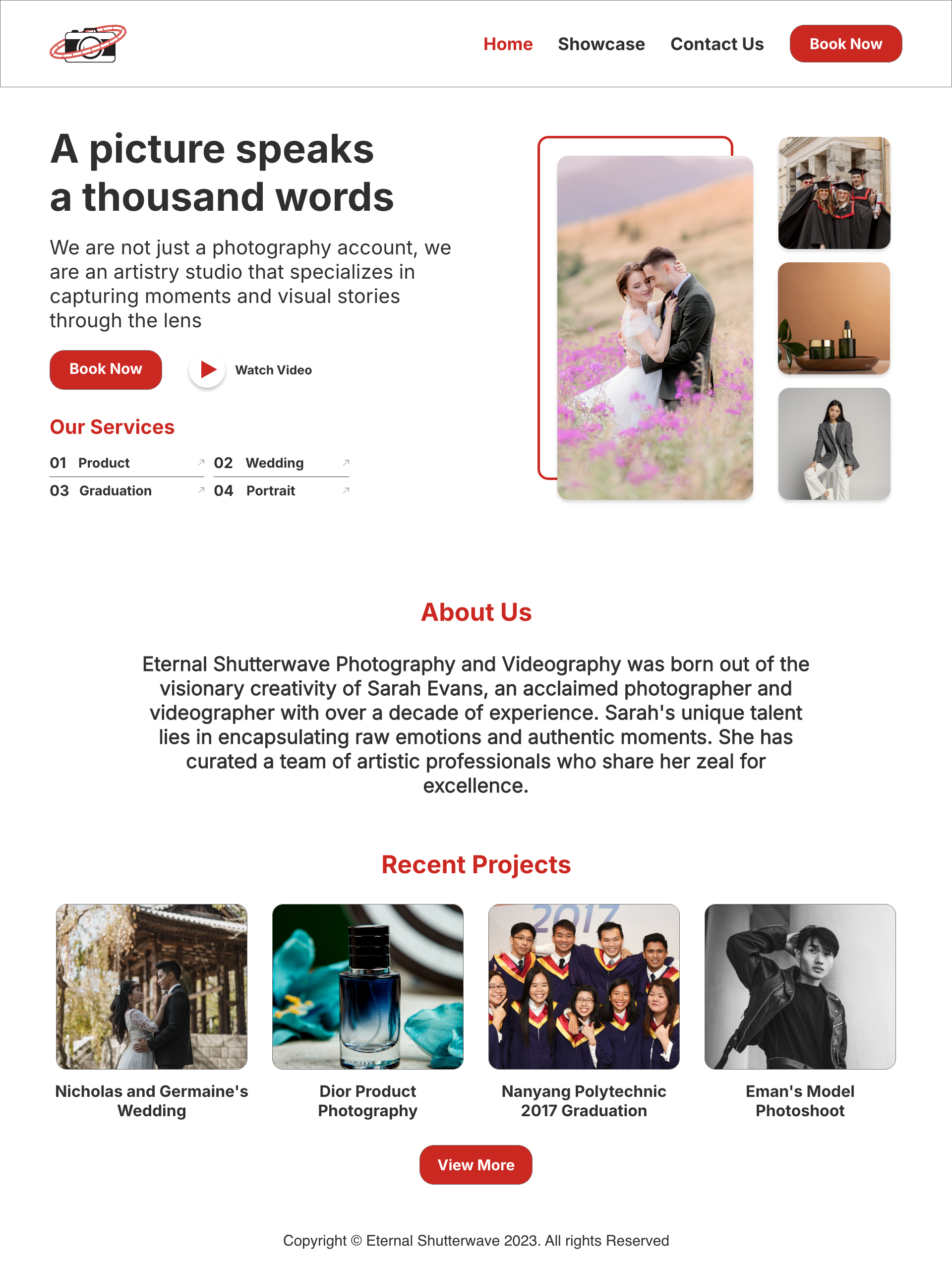
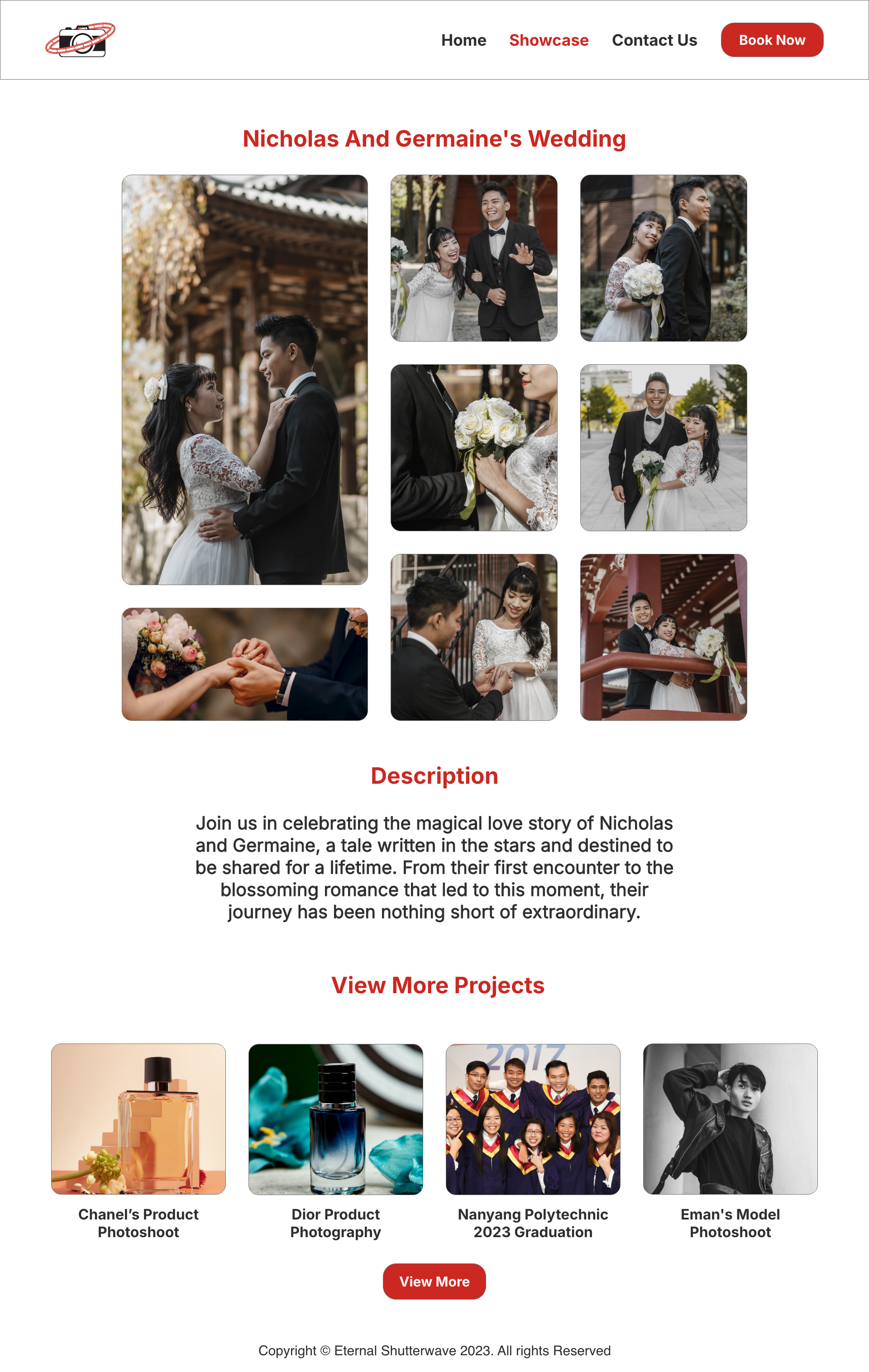
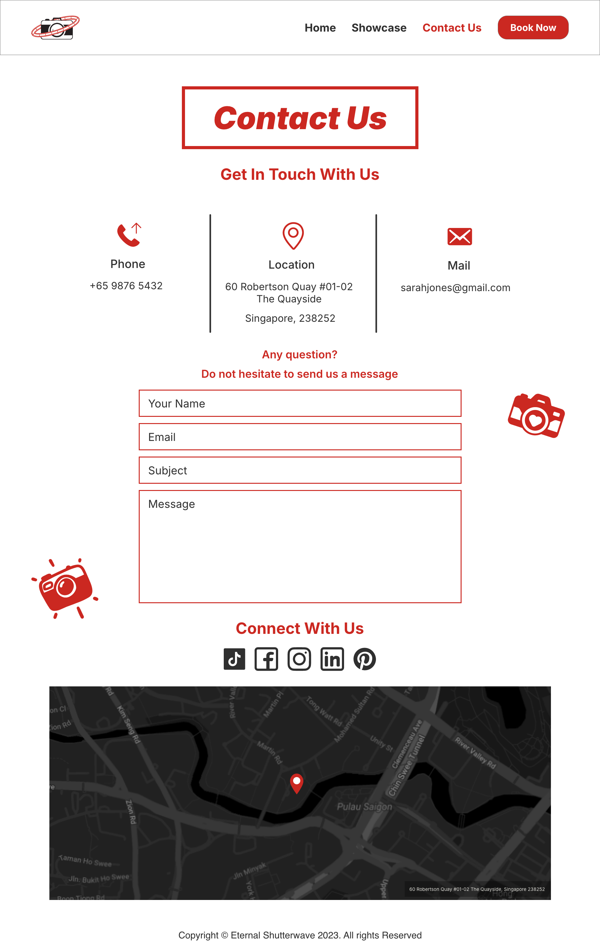
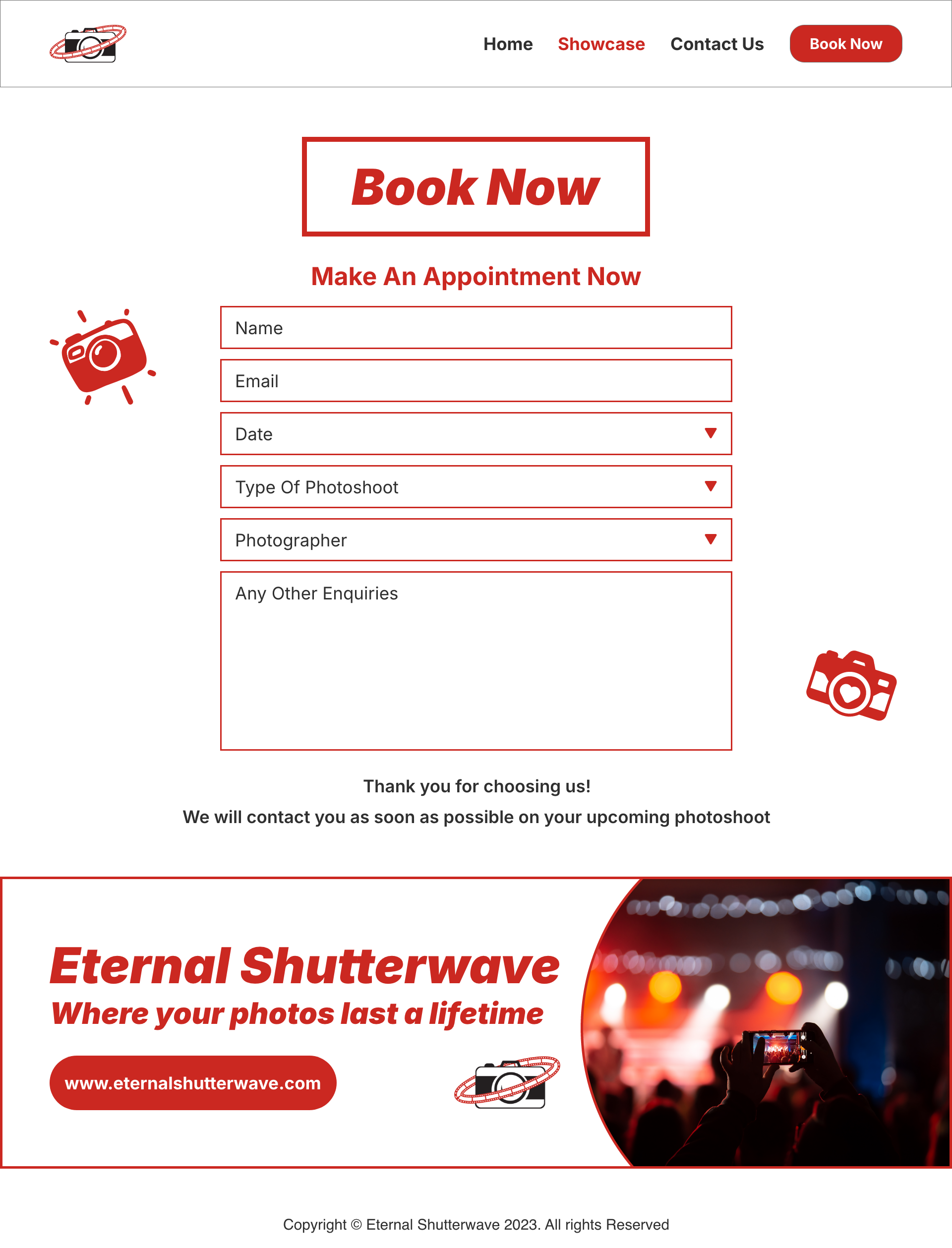
From first impression to booking.
04 / BRAND IN THE WORLD
The identity leaves the screen.
.png)
.png)


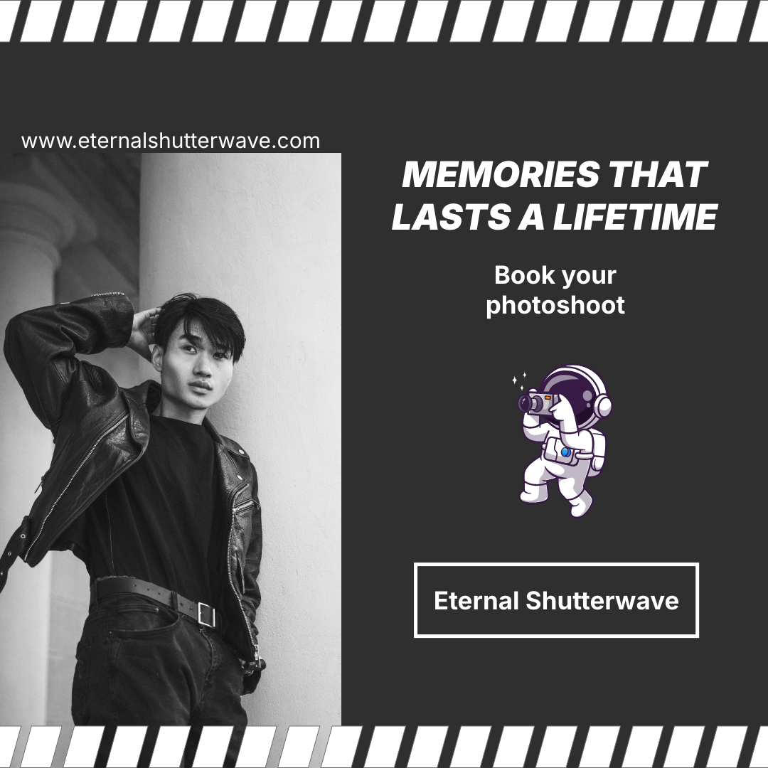
05 / KEY DECISIONS
Consistency creates recognition.
Keep photography dominant.
The interface supports the work rather than competing with it.
Repeat the wave motif.
The red wave creates a recognisable visual thread across every format.
Design a system, not a logo.
Typography, colour, imagery and graphic elements behave consistently together.
06
OUTCOME & REFLECTION
A brand becomes real when it travels.
Eternal Shutterwave helped me think beyond a single interface and consider how one visual idea can survive across digital, physical and promotional formats.
I would continue expanding the identity into additional applications and explore a dedicated responsive mobile website experience.