Surface useful stops from the user's location.
PRODUCT DESIGN · UI/UX · DEVELOPMENT
MyBus Finder.
A responsive bus information experience designed to help people in Singapore quickly find nearby bus stops, check live arrival timings and access the bus information they need while travelling.
01 / CHALLENGE
Bus information matters most when you need it now.
MyBusFinder was designed to reduce the steps between opening the product and knowing what to do next — whether that means finding a nearby stop, checking a bus arrival or looking up a known service.
Make live arrivals easy to scan and compare.
Support location, stop, service and repeat journeys.
02 / PRODUCT THINKING
Different starting points. One clear route.
MY ROLE
UI/UX Design
Information Architecture
Front-End Development
API & Technical Problem Solving
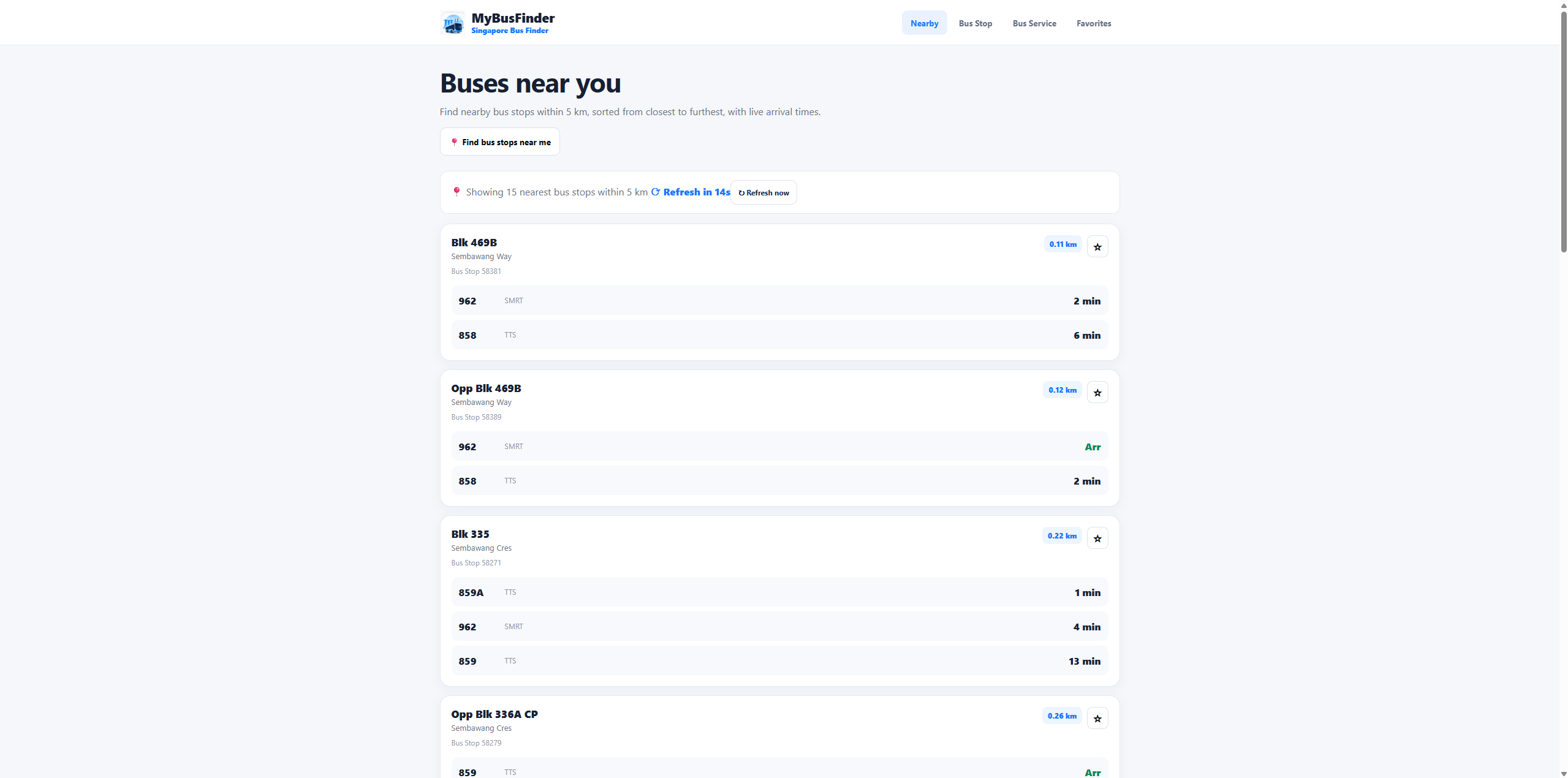
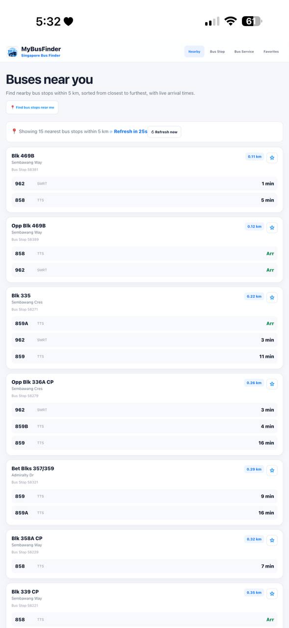
Nearby me
Location → nearby stops → live arrivals
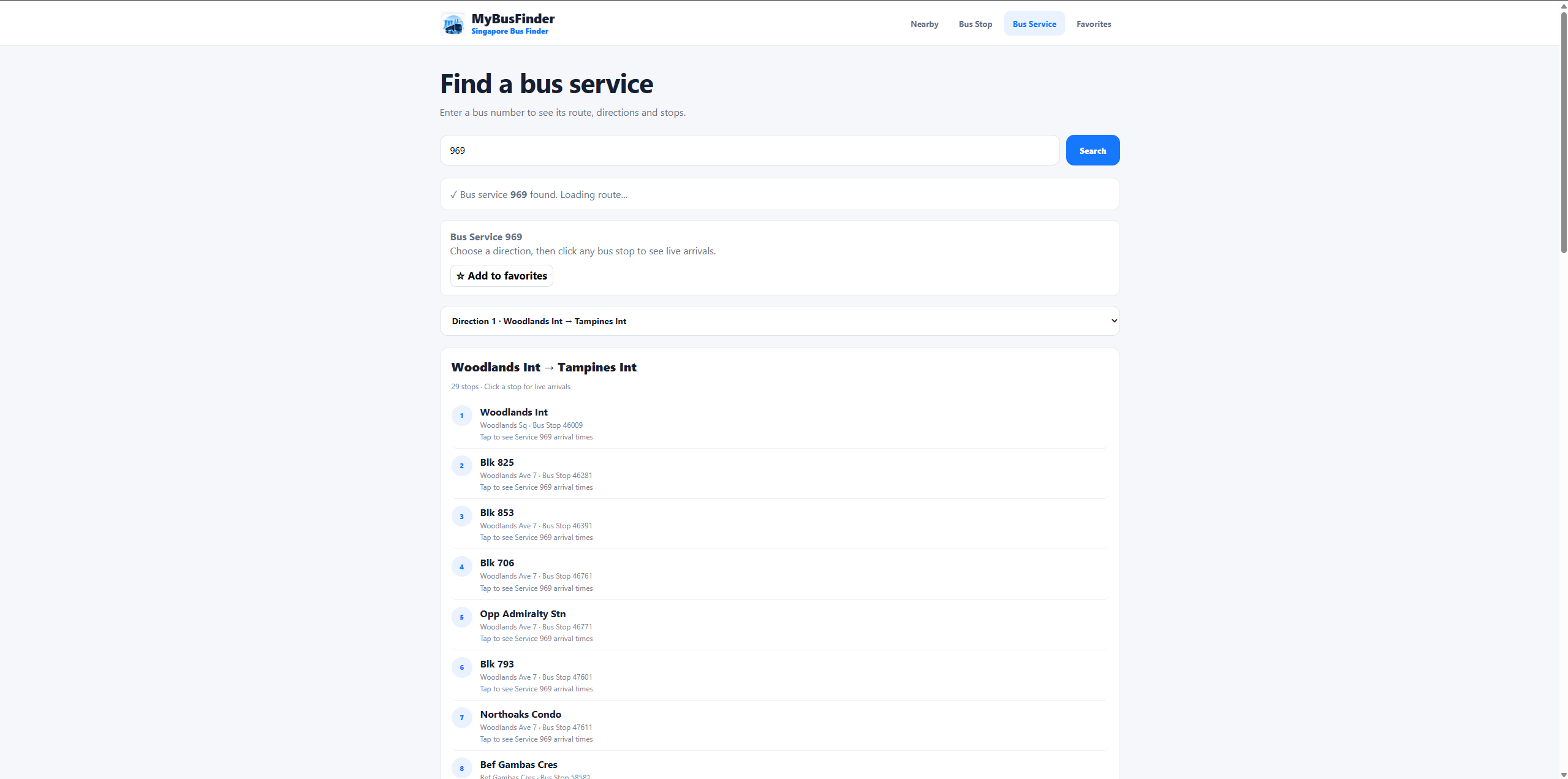
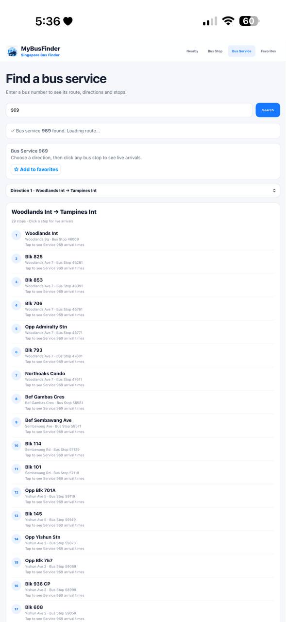
I know the bus
Bus number → service search → route & stops
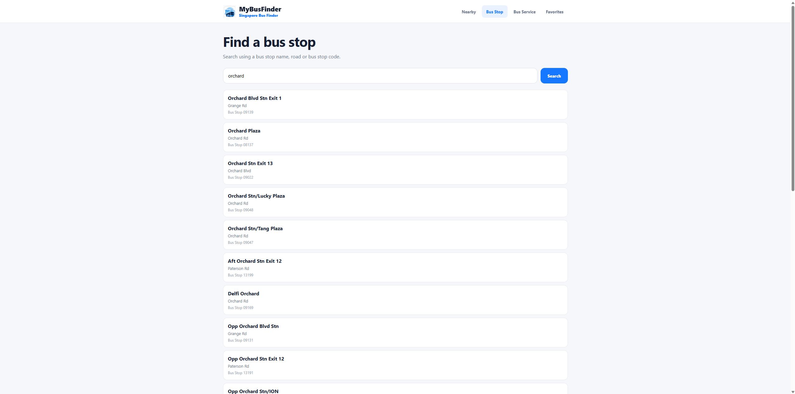
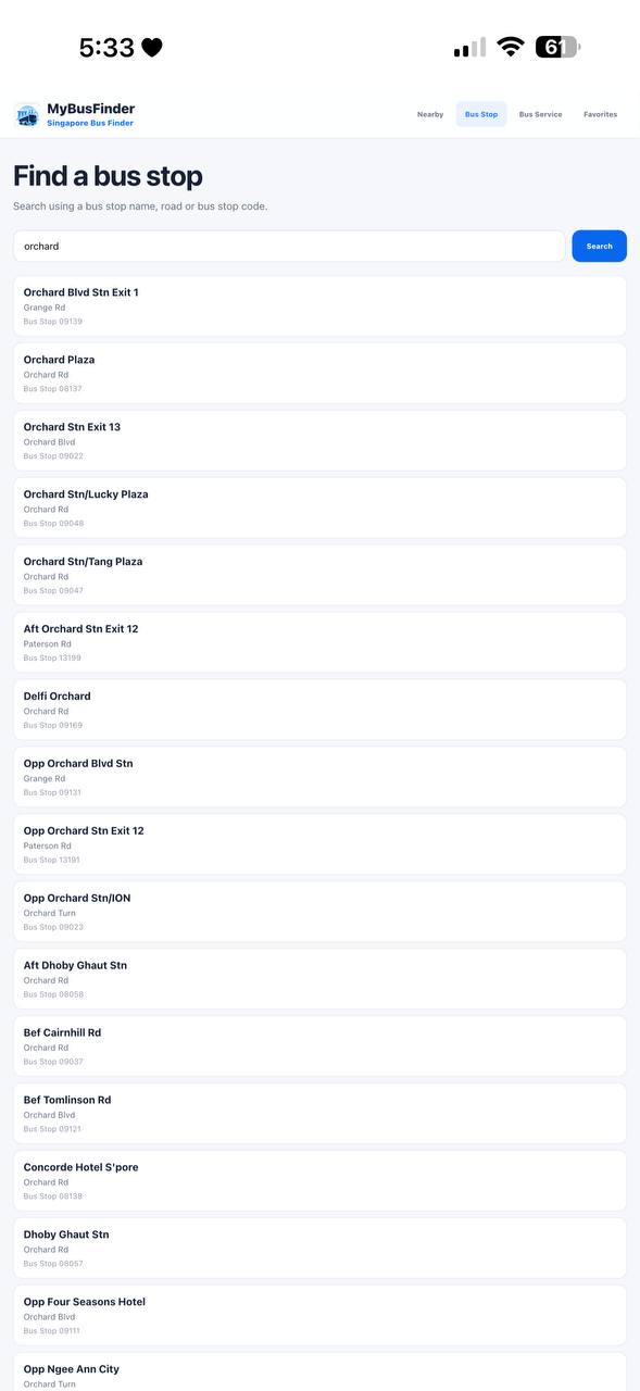
I know the stop
Stop or place → stop search → live arrivals
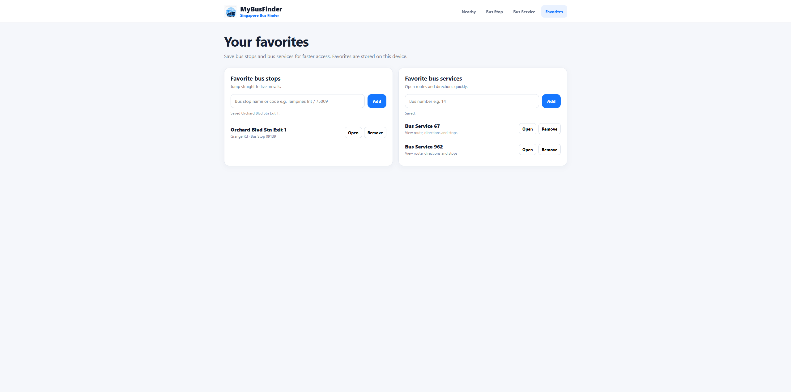
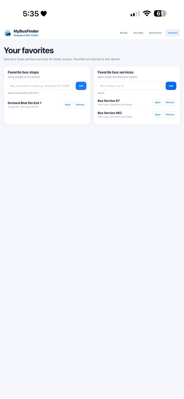
I use this often
Saved bus → favourites → live arrivals
DESIGN PRINCIPLE
Match the interface to the user's starting point.
03 / THE EXPERIENCE
More context on desktop. More focus on mobile.
RESPONSIVE APPROACH
The mobile version is not a shrunken desktop layout. It keeps the same four core tasks while prioritising what matters when someone is travelling.
04 / KEY DECISIONS
Three decisions shaped the whole experience.
Start with location.
Nearby travel already has context. Using location removes an unnecessary first search.
Separate stop and service search.
Searching for bus 67 is a different intent from searching for a stop near Orchard, so each gets a clearer path.
Put live timing in the hierarchy.
Arrival information changes what the user does next, so it needs to be easy to identify and refresh.
05 / DESIGN → BUILD
The happy path was only the beginning.
Turning the interface into a working product meant designing around live data, browser permissions, map rendering and failure states — not just polished screens.
LTA DataMall
Leaflet
Google Apps Script
AI-assisted debugging
Arrival timings change constantly.
Refresh behaviour and current timing needed to remain visible instead of making stale information feel permanent.
Location can fail.
Clear status messaging and manual search paths keep the product useful when permission is denied or delayed.
Maps support the journey.
Route information remains useful even when map rendering or coordinate data needs troubleshooting.
Shorten the feedback loop.
AI helped me isolate bugs, test implementation ideas and iterate faster while I made the final product decisions.
06
OUTCOME & REFLECTION
A clearer interface came from understanding the system behind it.
MyBusFinder pushed me beyond designing a polished happy path. Working with live services made loading, errors, refresh states and location feedback part of the user experience itself.
If I continued the product, I would focus next on refining map interactions, edge cases and the reliability of live-data feedback.